
Would Fred Astaire’s scintillating dance moves have looked as good if he had abandoned his usual suave wardrobe in favor of clothes that made him look like one of the irredeemable low-life characters represented in A Hillbilly Elegy?
We’ll never know, but there is one thing we do know: The best substantive presentation material looks even better if packaged well. Formatting slide shows is an art. Compliance with some basic slide show formatting principles won’t make you Monet, but will put you on the road to being a passable PowerPoint artist:
Colors
Old fashioned transparencies, often referred to as overheads, worked much better with dark text on a light, preferably white background. Modern computer slide show projectors use a different technology. With computerized slides, light colored text against a dark background works much better.
What background color is best? Some authorities suggest trying to match colors to the emotional mood you are trying to create. For example:
- Purple: Royalty, wisdom, spirituality, mystery
- Green: Nature, environment, health, reptiles, insects
- Gray: Conservative, practical, reliability, security, staid
See the Think Outside the Slide website for more.
Certainly, there might be some benefit to this emotional manipulation approach in some situations. However, as a practical matter I usually give these factors little consideration when preparing my own slide shows.
I normally use the color combination that is generally acknowledged to have the highest legibility: Dark blue background, with light text, usually white or yellow. I probably use this for over 90% of my presentations.
The most important thing for me is that the audience be able to read the slides easily. I’ll use methods other than color if I feel I need to manipulate the audience’s emotions.
Whatever color scheme you choose, to improve legibility try to maximize the contrast between foreground and background. Light grey text on a medium gray background is a recipe for disaster. The Think Outside the Slide website has a color contrast calculator.
Font Selection
Selecting exactly the right font for the right job involved a depth of knowledge and experience beyond the reach of most lawyers. Fortunately, unless you are seeking the approbation of experts like the estimable Matthew Butterick, author of Typography for Lawyers, a few basic principles will give your work a suitably professional appearance.
Use serif fonts for large blocks of text.
Use sans serif fonts for headings.
There is a lot of confusion about the differences between serif and sans serif. This picture illustrates the differences:
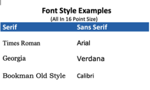
Serif fonts, like Times New Roman, have small ornamentation at the ends of letter strokes, called “serifs,” or “hinting.” Sans serif fonts, like Arial, lack such ornamentation.
In general, serif fonts are better for printed matter, like books or newspapers. Sans serif fonts are better for computer displays.
Serif fonts are easier to read in big blocks of text. The serifs (sometimes called “hinting”) help readers recognize the shape of a word, rather than decoding each letter individually. This is why most books are printed in serif fonts.
Sans serif fonts are easier to recognize as single words. This is why serif fonts are used for traffic signs. Professional typographers tend to use sans serif fonts for headings, and serif fonts for text body. You should take the same approach.

The problem with serif fonts is that they are harder to read at low resolutions, like on computer monitors.
For example, laser printer resolution starts at 300 d.p.i., and can go up to 1200 d.p.i. Times Roman, a serif font, works well at these resolutions.
By contrast, computer monitors (and projectors) have much lower resolution.
Screen Fonts
Recent decades have seen a new development: Fonts designed specifically for computer display, sometimes called “screen fonts” or “web fonts.” Verdana (sans serif) and Georgia (serif) are examples. Google Fonts has a selection of free screen fonts, and an explanation of how to use them.
Font Size
Some authorities suggest rules of thumb for sizes. However, point sizes of different fonts are not directly comparable, so I recommend a more pragmatic approach: Test the size of your font from a distance equal to the distance from the most remote seat in the auditorium you will be using.
Using The Fonts You Have Selected
Once you have selected a suitable font, use it correctly:
- Be consistent: Use a limited number of fonts to maintain a cohesive look.
- Establish a Hierarchy: Reinforce the way you organize your material by using a scheme of consistent font styles, weights and sizes.
Bullet Points
Bullet points have the salutary effect of improving quick comprehension. However, deploy them wisely. Squeezing too many bullet points on a slide creates a cluttered impression. No more than five bullet points per page is a pretty good rule of thumb.
Avoid having more than two levels of bullets on slides. In other words, you can have a bullet point, and one sub-level below them. If you need more sub-levels to convey complex ideas, it’s better to break them into more slides.
Templates
Good slide show software provides templates (called “slide masters” in MS PowerPoint) to provide a consistent layout. I occasionally see presenters who do not use templates. It’s nearly always a mistake. The templates are designed by pros. The defaults in a decent template will facilitate a professional appearance. A Google search on the phrase using powerpoint templates will find plenty of tutorials to get you started.
You can:
- Override the template for a particular slide or
- Modify the template (surprisingly easy)
You can even create your own templates, not something I’d recommend to most lawyers. In any event, using templates is an easy way help make a good impression on your audiences.
Logos
Some presenters who have just learned how to edit templates or create their own succumb to the temptation to include their organization’s logo on every slide. This is popular in businesses as a form of branding, but there is a drawback. Including a logo on every slide limits flexibility.
The best approach is probably to include the logo on the first slide, and maybe the last. If demands of unsophisticated supervisors or an overly doctrinaire marketing department make you feel you absolutely must include the logo on every slide, make it small, except on the first slide and the last, where you can usually get away with more.
Whatever you do, don’t follow the example of one government conference presentation I saw that included no less than four different agency seals on every single slide, one for each of the four presenters!
Learning More About Presentations
I have 20+ titles in my personal library of books about presentations—and I’ve even read most of them. If I could keep only two, my choices would be:
Since the publication many years ago of Dan Gookin’s DOS for Dummies, the first book in the successful Dummies line of technical books, I’ve been ambivalent about the company’s naming and marketing strategy. However, when a book’s content is good enough, who cares if it has a condescending title?