
How crowded do you like your Google News page?
My choice is very. I want to skim through a number of headlines at once, lickety-split. I can always drill down in depth via links if the topics interest me.
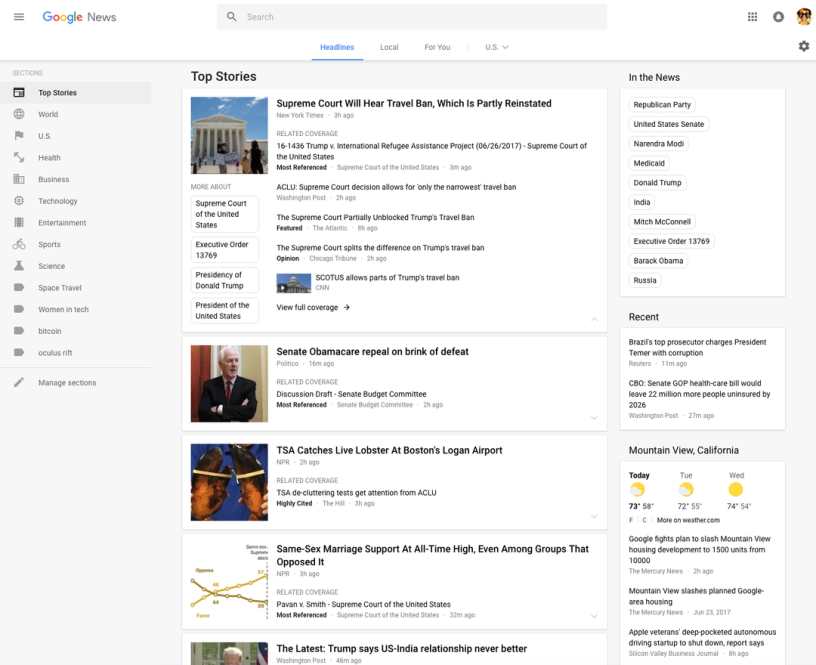
Google’s new more open look really sucks for power users like me, and plenty of others agree.
The “Do No Evil” people can keep the new look as a default if they absolutely insist on doing do. But they should give us the choice of returning to the old one. At the same time we should be able to enjoy the new features Google has added to help us control what items we see.
Here’s a sample of the overwhelmingly angry comments from people in the Google forum linked above, and if you can add your own, so much the better.
-
- “I dislike the new look and prefer classic view. Please provide a knob to restore classic appearance. The new look shows far fewer articles than before, wastes screen space, etc.”
- “I hate the new format… It does not have any tools for All, Images, Video, Shopping. or More (tools to set search dates such as ‘past 24 hours,’ ‘past year,’ etc). How can we get the classic format back?
- “This is weird – I can get the classic format with all tools included if I go to Google News on Firefox, but all I get on Internet Explorer 11 is the horrible new format. Google, please give us back our classic format on all browsers!”
- “This layout makes perusing headlines to find one interesting thing far more difficult and time consuming. I don’t need 7 different sources for the same top story. Make that list hide-able/expandable like the old version.”
- “Many posters are saying they’re moving on to better news sites. I’m leaving too. Last time they only ruined the U.S. version so I simply started reading the Canada one. This time they’ve destroyed all English versions. I’ve been at Bing ever since the redesign. If they stick with this fiasco, I’ll never come back.”
You can log out of your Google account or go into the incognito mode of your browser and possibly see the old version. But then you lose your personalization, one of the very strengths of Google News.
While I can appreciate Google’s desire to be mobile friendly, expose people to different viewpoints, and so on, I hate the way the company is slowing me down. I’ve got a 55-inch desktop display for ergonomic and health reasons. Why the devil should Google treat me the same as a mobile phone users with a near-postage-stamp-sized screen?
Yes, I checked out Bing’s news page. Alas, that look also isn’t crowded enough for me.
This is another example of tyranny that the conformists in design community impose on the rest of humanity. It reminds me of my past battle with Amazon over the excessively light Kindle fonts that the designers favored.
Luckily, Amazon wised up and offered a nice boldface alternative. I hope that Google will show the same respect for Google News users and let us switch back to the old look.
Especially with Google under attack by anti-trust regulators in Europe, it can ill afford arrogance in an any way, even on something as mundane as the issue of Web site flexibility.
Editor’s note: this article represents the views of the author, and is republished with permission of the author from his site, TeleRead.